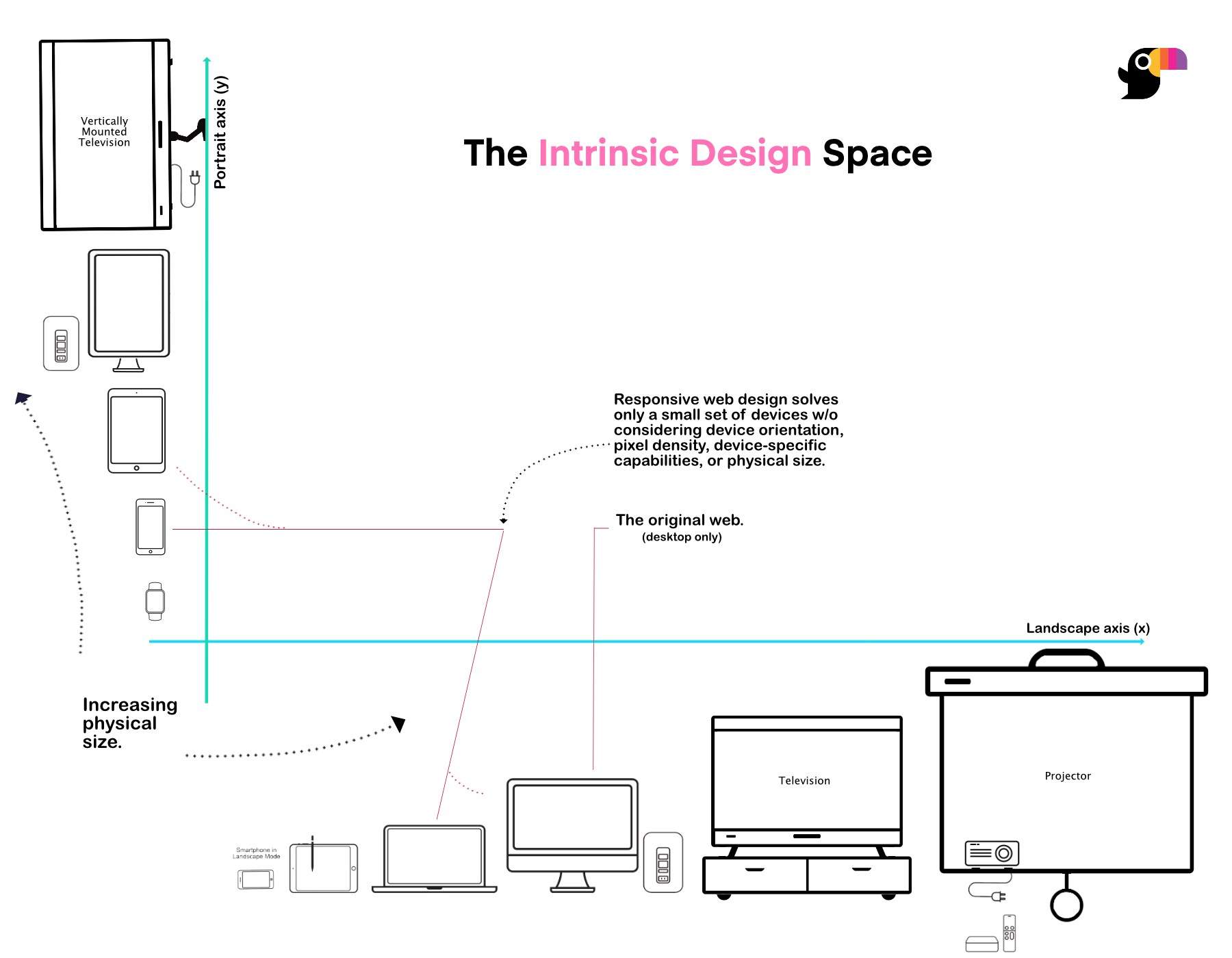
2. The Design Space
Intrinsic Approach to design is very different from a responsive one.
By definition, intrinsic implies designing interfaces that "belong to" a device. Meaning, interfaces that are contextually relevant for the medium they are built for. Intrinsic Design is more of a design philosophy that aims to drive an optimum experience on a medium using the intrinsic qualities of the device. Qualities like the physical size, orientation, pointer-driven or not, and other accessibility constraints and considerations.
Build UX/UI befitting user's personal choice of hardware and its underlying capability.
Toucaan and The Axes of Intrinsic Design
Toucaan is a simple implementation of the routes required along the Two axes of Intrinsic Design.

Observe the increasing order of physical size of the web devices on the two axes. Then consider how the orientation of the viewport and its physical size affect the context of your application design.
By designing for a contextually relevant experience this way, the author not only finds their way to an ideal design solution for different mediums, but also they address the accessibility situation each time in a deeper and much more meaningful way.
The fact that the hardware industry rolls out new consumer devices each year with often higher specification (screen resolution, dimension, choices etc.), we can assume that the physical size of the shining glass is practically like the resizable window of a desktop browser.
How is this different from Responsive Design?
From the plot above, one can see that responsive design is just one point of solution in the overall intrinsic design space (marked with red-lines above). One way to visualize the difference between responsive design and intrinsic design is to consider the differences between mobile web and native apps. A native app often feels more natural to use on mobile because its layout and design elements belong to a mobile intrinsically.
From a technical standpoint, the main difference between intrinsic and responsive approaches is that the intrinsic implementation does not consider mobile web and desktop web on the same axis of design.
Mobile falls on the y-axis or portrait axis of intrinsic design whereas the desktop falls on the x-axis or the landscape axis of intrinsic design.
This difference can have a serious impact on the outcome of wire-framing functional design.
For example, with Toucaan a designer doesn't need to switch context between a desktop and a mobile or even correlate the two. It allows the designer to think of each medium independently.
There is no functional relationship between how an app should appear on the desktop and how it must on a mobile. Therefore, the tendency to resize the browser down to squeeze the desktop application design to fit a smaller viewport is incorrect. Each slate of design must have an independent start.
Toucaan doesn't use hardcoded MQ break-points to switch between mobile and desktop layouts. This means that resizing the browser to a smaller width will not invoke the mobile layout. It will show the desktop-layout only, but for a smaller rectangle (or no layout at all).
Is Toucaan a Design System?
Toucaan is a simple css framework. It is not a design system and this is intentional.
Toucaan is aimed at makers who like to design their apps themselves––as in, keep the control over design elements without any debt from outside. One of the main reasons why Toucaan doesn't overstep into becoming a design system is to avoid the prescriptive nature of a design system. All websites using a design system end up looking the same. The idea of pre-built styled components kills the opportunity for the maker to dive in and apply their own design logic (or skill) into the application.
A design system could be built on top of Toucaan, but that will probably have to live on a separate repository elsewhere.
What is the end-goal of Toucaan?
Toucaan aims to cover more mediums on the web today than a responsive framework could support. By splitting the canvas of digital design into industrywide categories of the viewports (or products) like the desktop, mobile, tablet, vehicle, smartwatch, and TV/projectors, Toucaan not only makes room for deep focus on intrinsically oriented experiences (accessibility and scalability) but also forces the developer to arrive at an architecture that is both durable and maintainable over the years.
At this stage, Toucaan is a recipe in motion, so all kinds of feedback and contribution are welcome.